03 Text, typography, data
Its ALIVE!
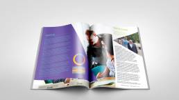
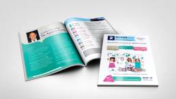
When your text becomes alive it completes the entire look of your annual report, leave your trusted text in my capable hands and watch me transform it into fluent and beautiful words that flow with the design of the annual report.
When it comes to the details, I will ensure I always check the below with all my clients, being aware of restrictions, parameters and how far I can push the artistic boundaries is essential:
-
- Branding guidelines
- Text
- Typography
- Data
Let me explain a little further
-
Branding guidelines
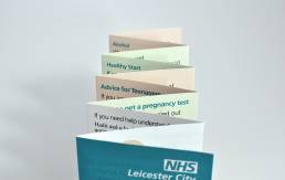
Do you have specific criteria, logo and colour pallet restrictions for your organisation or brand? Then be rest assured that I will scour it thoroughly to guarantee a well-presented annual report that respects the guidelines of your business. Having worked for institutions like the NHS I am well versed on how to work within branding guidelines and still produce imaginative and flawless annual reports.
-
Text
Want your text to come alive on the page? Want your text to be understood, digested and look inviting to read? As a text and typography expert I can take any text however long, short or technical, add my creative wizardry and turn it into engaging and understandable copy.
-
Typography
I eat, sleep and dream in fonts and types, if there are limitations to the type and size of fonts that need to be used then I will always take that into consideration first and foremost.
-
Data
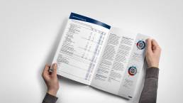
Do you have a lot of data that needs to be incorporated into your annual report? Is your annual report heavily reliant on numbers? Then you have come to the right place, I have designed many annual reports that have required me to crunch, digest and produce diagrams of data from pie charts, bar charts, line graphs to pictograms and many more.
Do you need a new look for your annual report?
Recent Projects


